THE BALANCING ACTS OF MODERNISM
There’s something appealing about an object that seems to be delicately balanced.
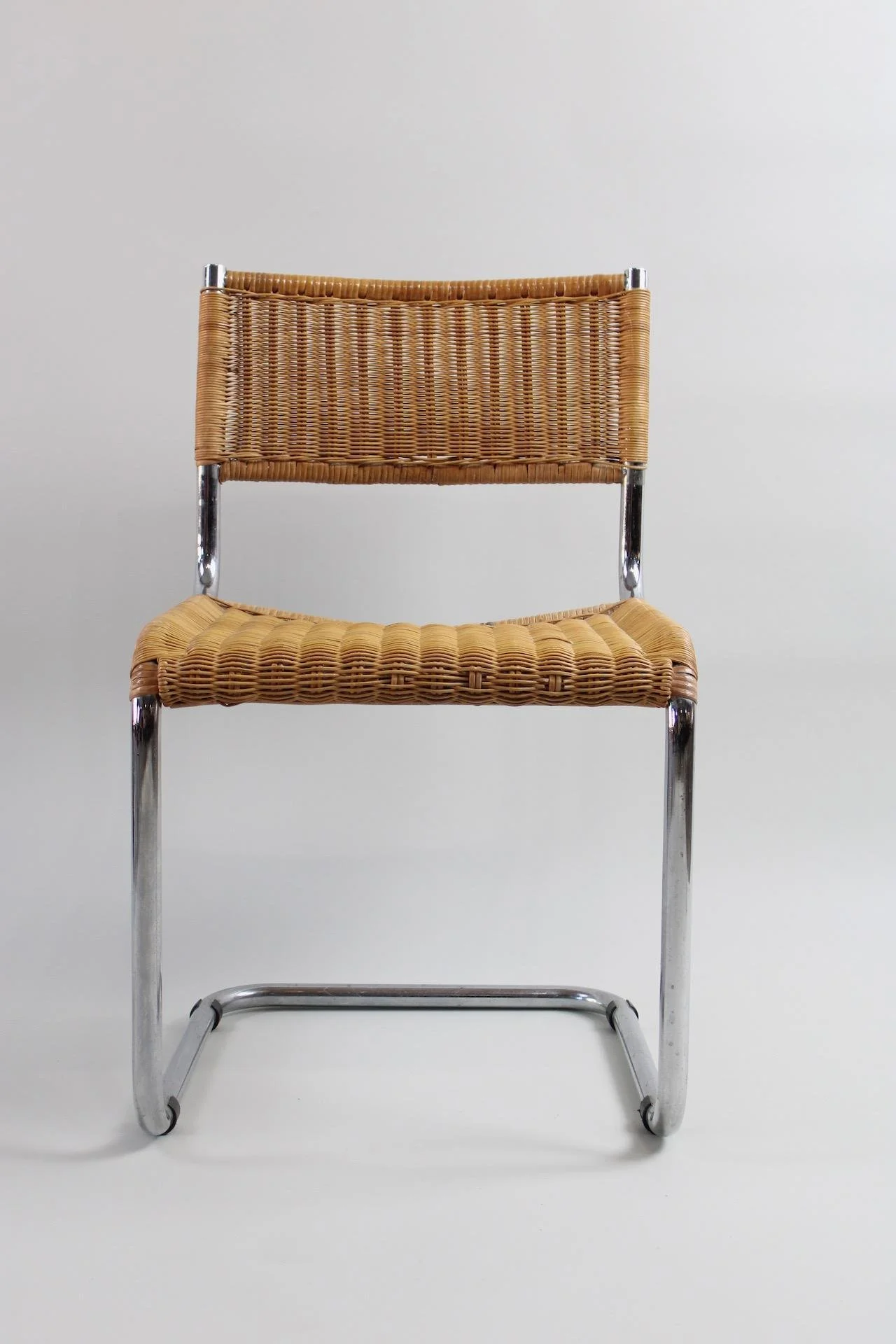
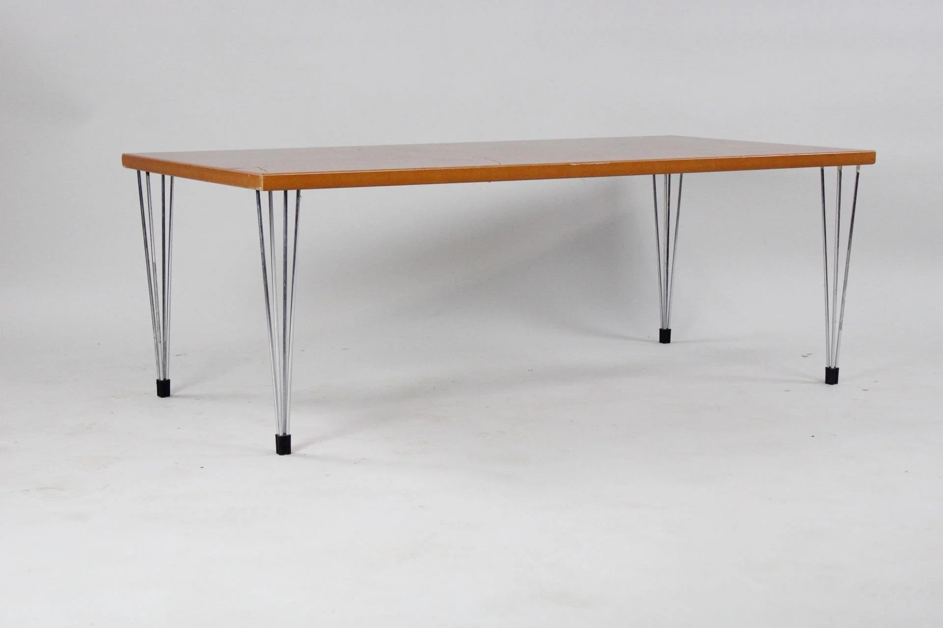
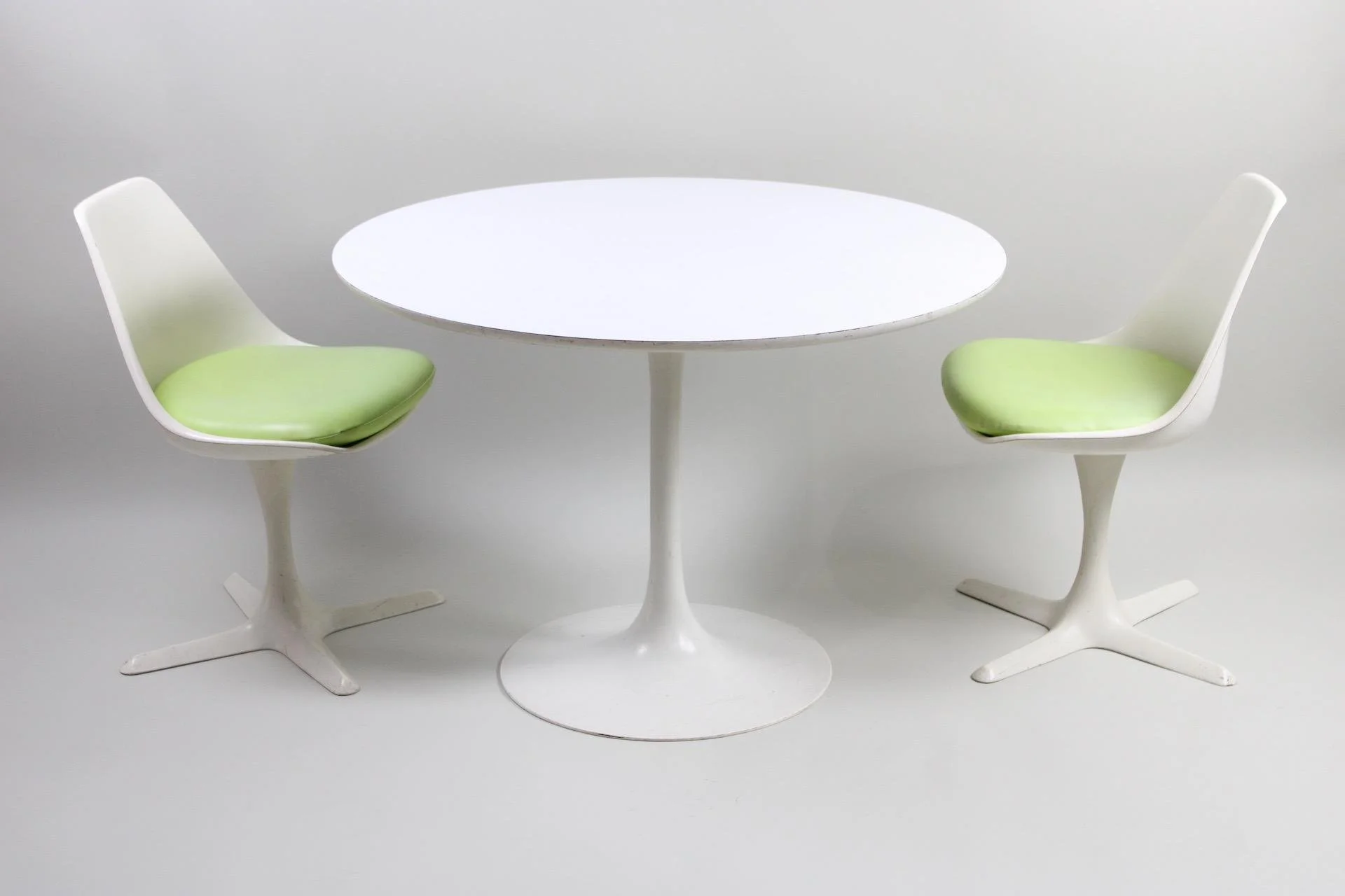
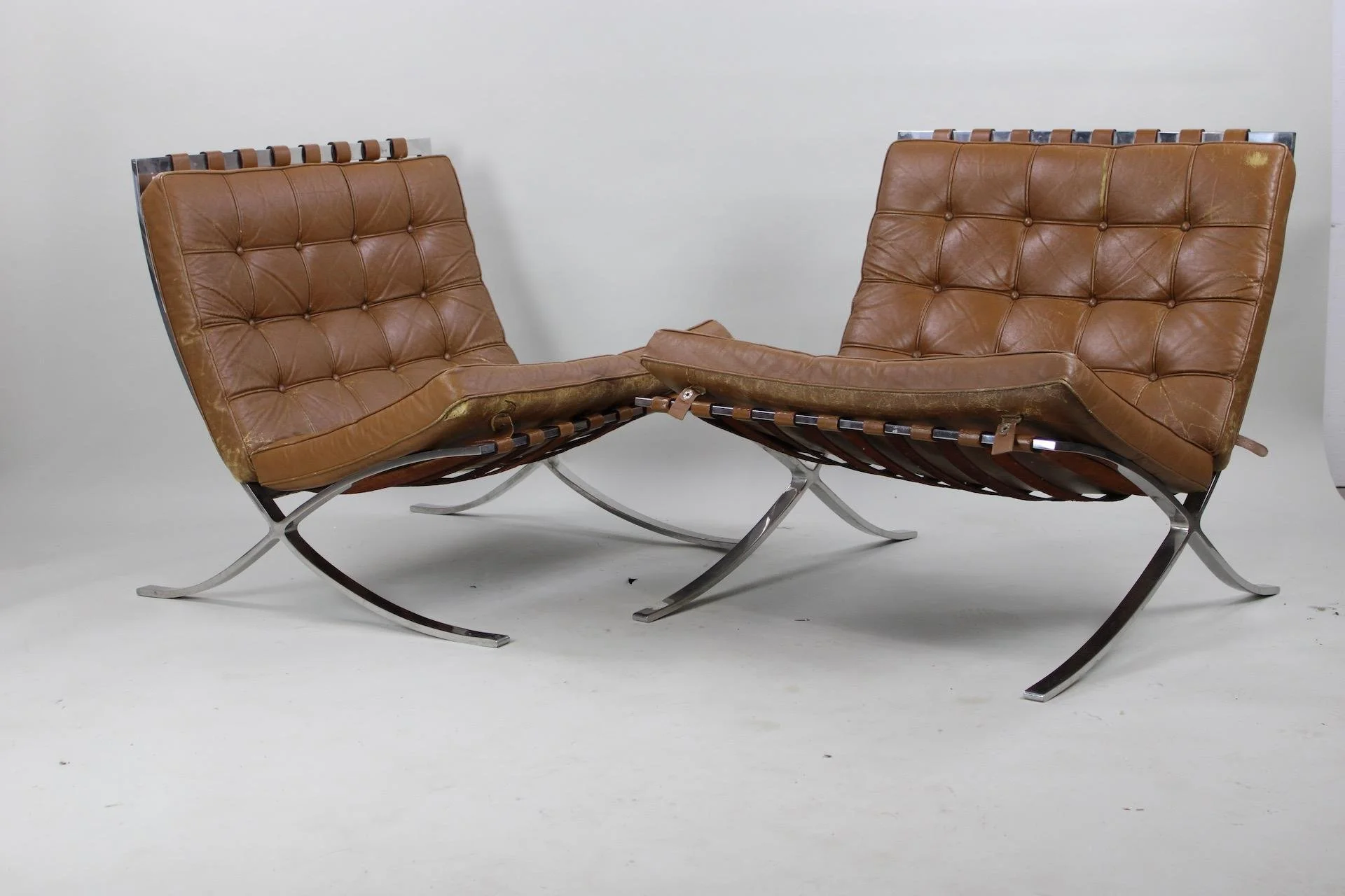
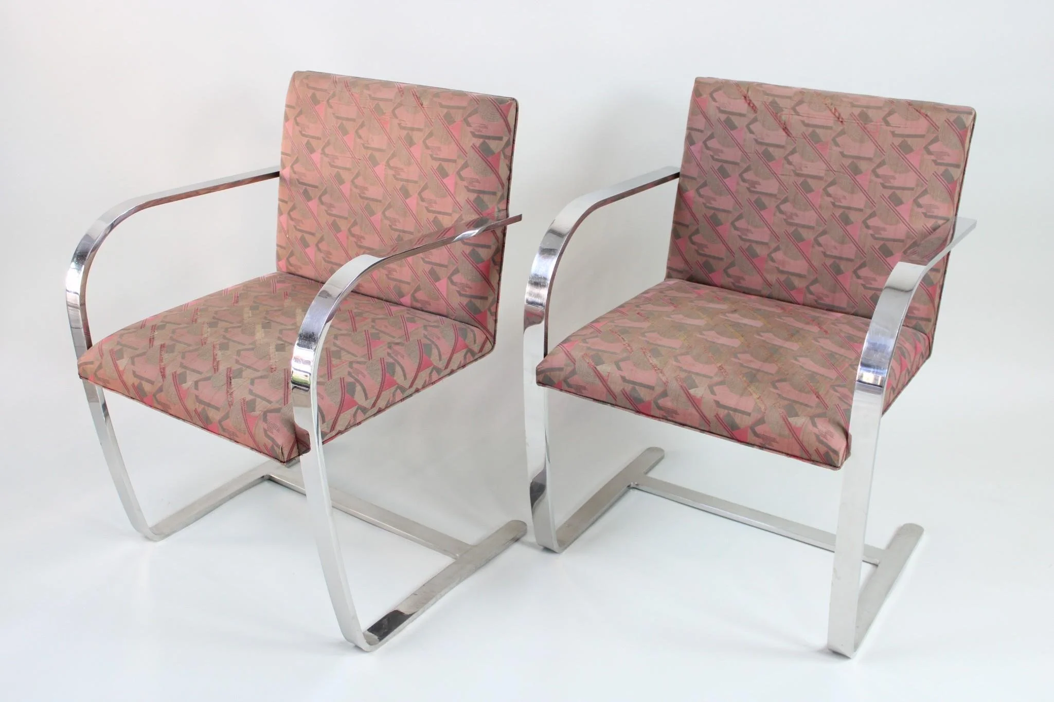
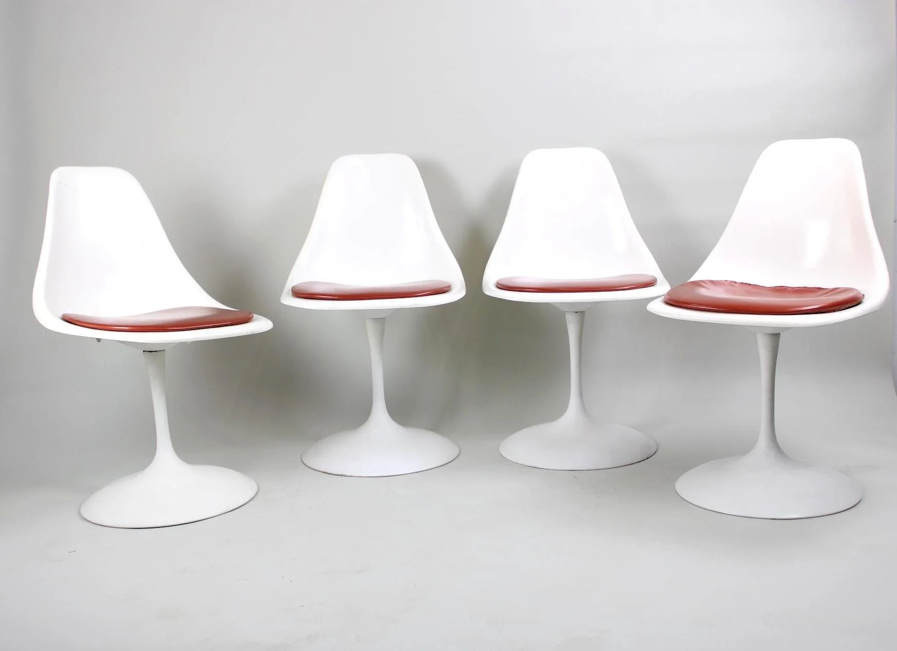
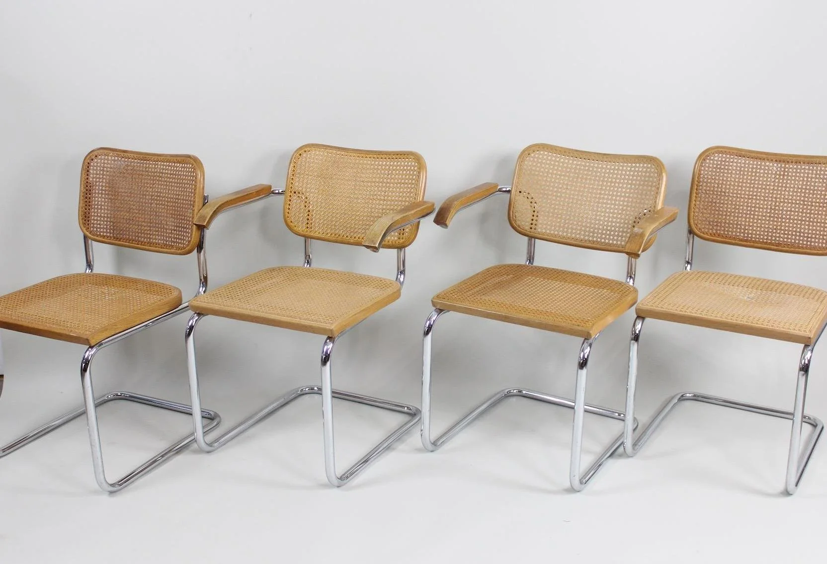
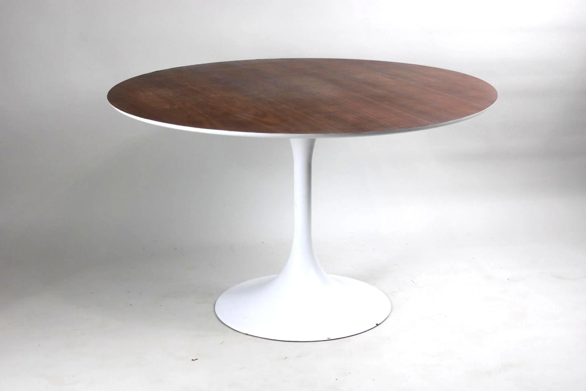
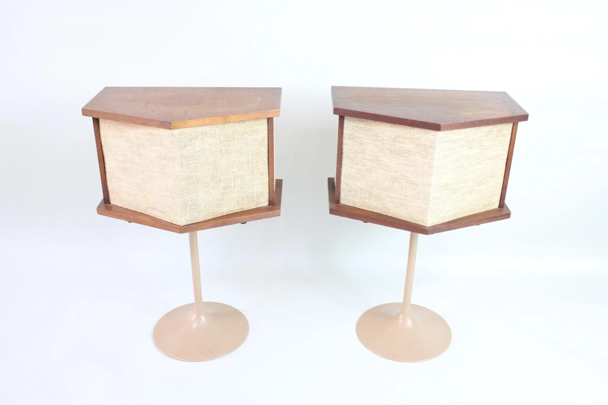
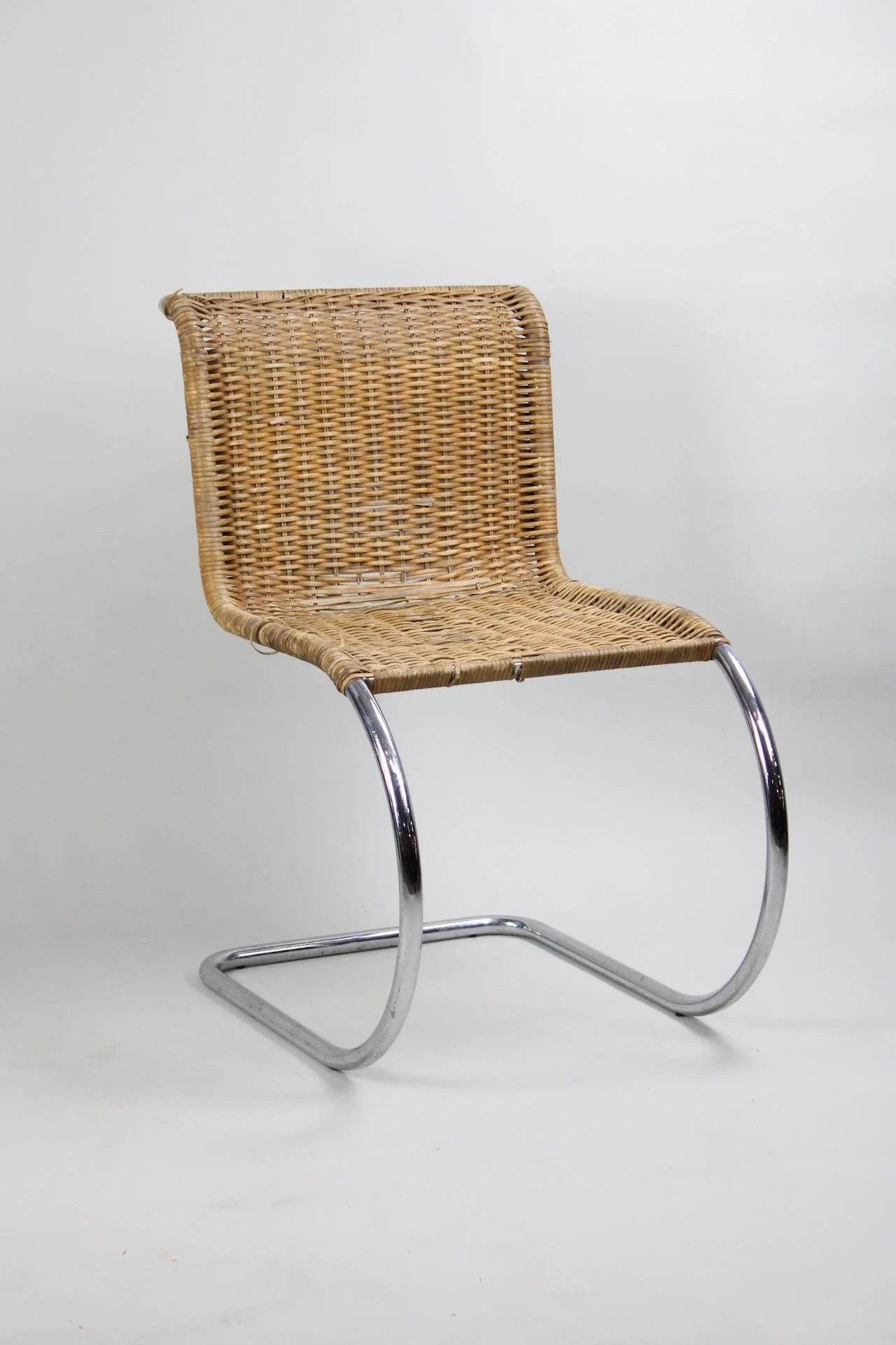
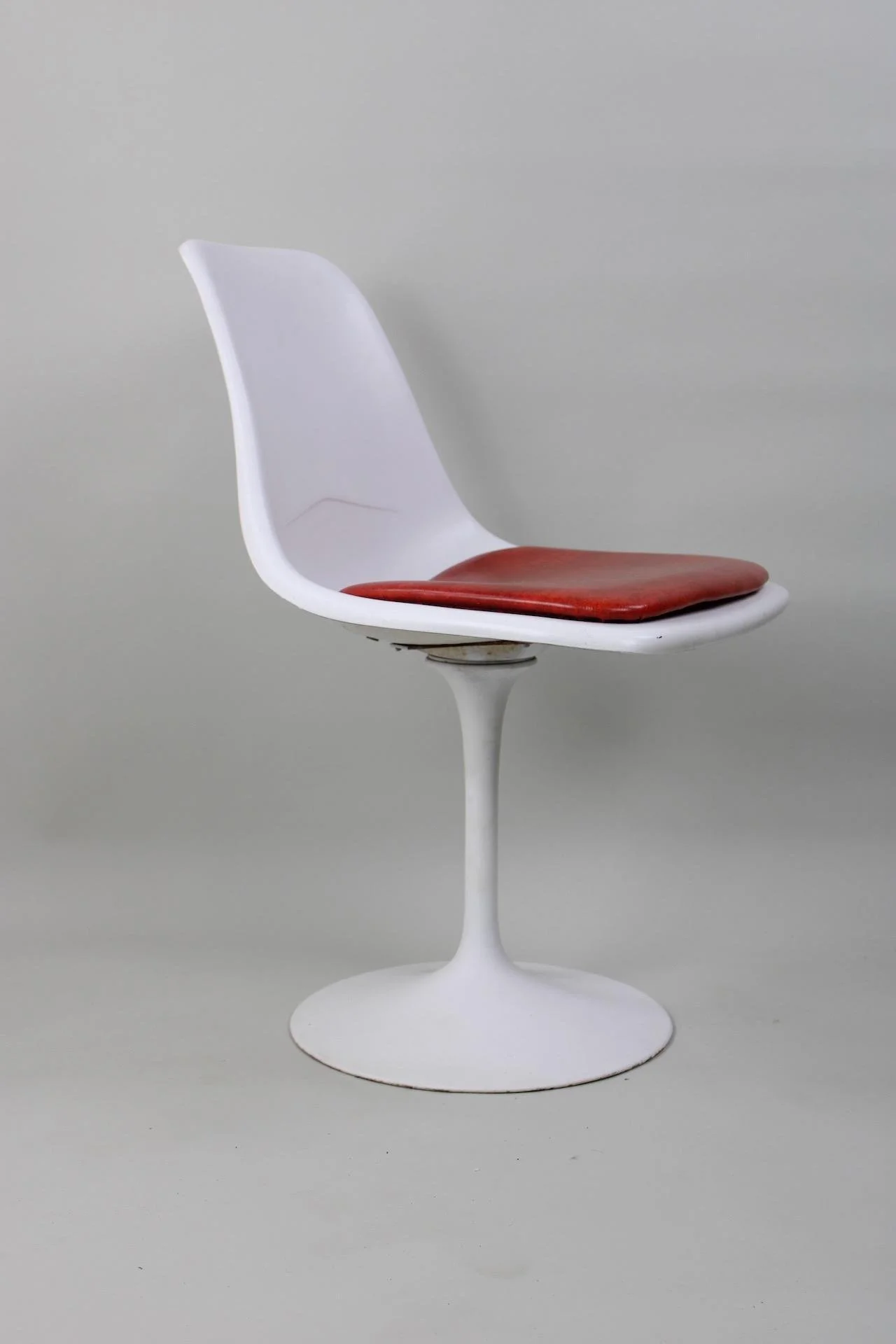
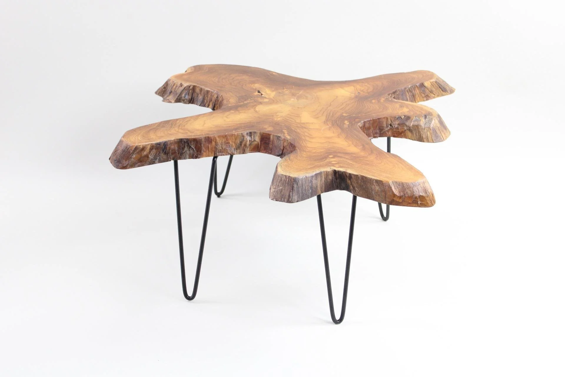
Mid-Century Modern furniture designers found many ways to exploit this feeling, whether through the cantilever structure achieved with the scissor design of Mies van der Rohe’s Barcelona chairs [Lot 81] or the “tulip” shape, pioneered by Eero Saarinen, of narrow upright support between wide base and top [Lots 45, 69, 397, 449, 463, 493]; or through the curved tubular steel that gives chairs that unlikely hovering effect [Lots 1, 103, 408, 492]; or in the iconic “hairpin” legs of the Mid-Century style [Lots 65, 498], so vanishingly thin in comparison to the thick wooden slabs they often support.
Equally appealing is when one can use these balanced objects— sit in the chair, or dine at the table—and they remain undisturbed. Though some of their structural principles were anticipated in earlier furniture, such as folding stools, many of these designs were impossible to produce before the material and manufacturing innovations of the 20th Century.
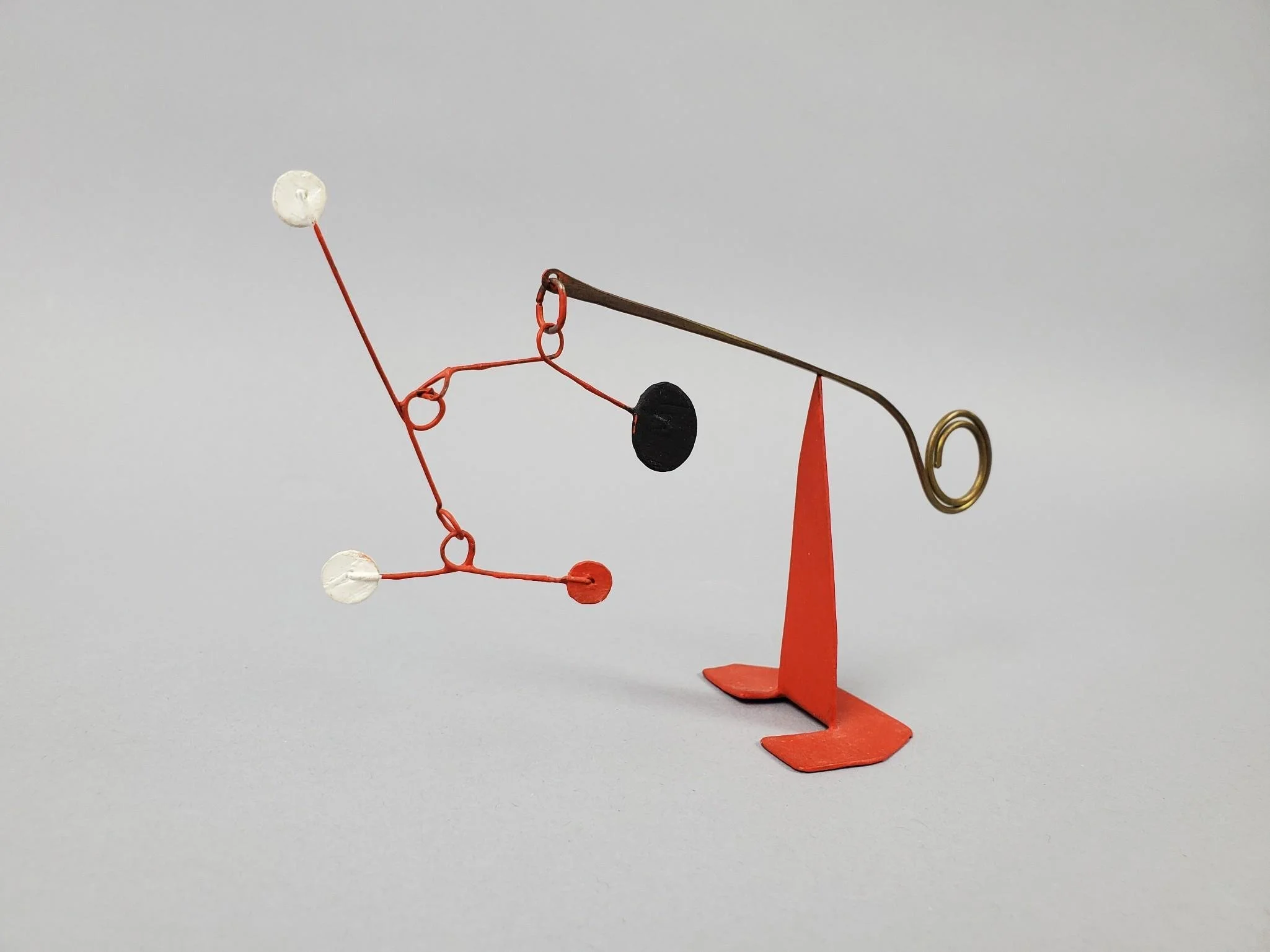
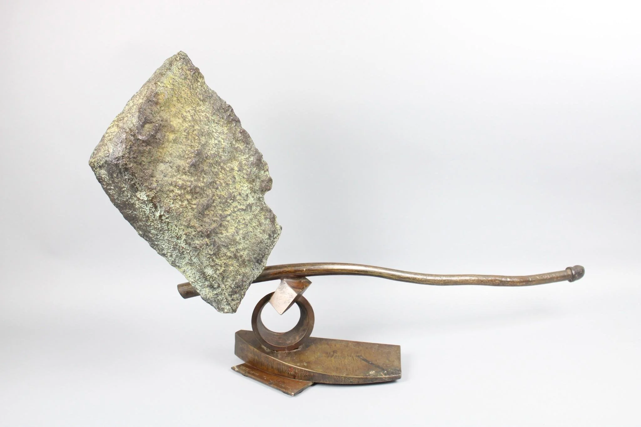
Modern sculpture also sometimes exploits that sense of precariousness, from the tiny pinpoint fulcrum of sculptures in the style of Alexander Calder [Lot 250] to the large stone-like shape that seems to defy gravity in John Van Alstine’s sculpture [Lot 362], fittingly titled “Falls”. Indeed, the work of so many Modernist designers seems to achieve a balancing act between furniture and sculpture, utility and aesthetic contemplation, form and function.
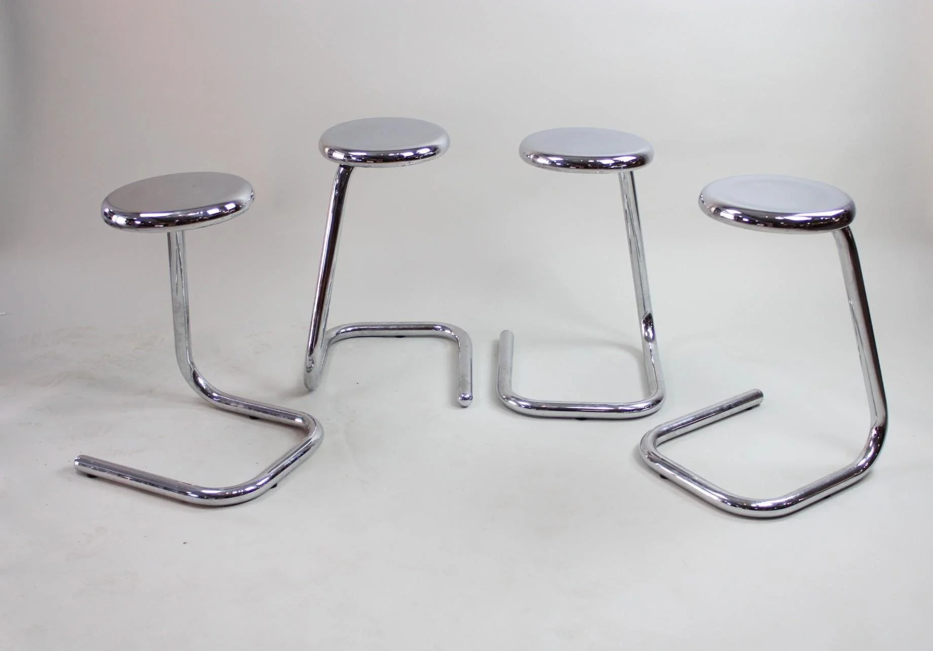
The monumentality brought to these domestic objects is ironic considering the structural qualities of bent metal, its elasticity and torsion, are simply a scaling up of an even more ubiquitous design invented at the very beginning of the 20th Century, 1901 to be exact: the humble paperclip. This family resemblance is playfully referenced in the design of the so-called “paperclip” stool [Lots 19, 299] upon which you can sit and balance yourself, and become part of the delicate play of Modernist design.

